Wednesday, 12 December 2012

Lecture: High Culture vs Low Culture

Objectives:
- Understand the term 'avant-garde'
-Question the way art/design education relies on the concept of the avant-garde
-Understand the related concept of 'art' for art's sake'
-Question the notion of 'genius'
-Consider the political perspectives relating to avant-gardism
-Question the validity of the concept 'avant-garde' today

Avant Garde Goth Bold

Marcel Duchamp

'Fauves' Wild Beasts


LCAD quotes priorise certain concepts:- (feel free to question these)

1. innovation (Creating new stuff)
2. Experimentation (process involved in order to achieve new stuff)
3. Originality (to copy is bad, to be original is good)
4. Creative genius (to bring out a hidden creative depth held deep within the student)

Art for Art's Sake
Whistler Nocturne in Black and Gold: The Falling Rocket, 1875

End of the 19th Contury/ Early 20th C
-two approaches to avant-garde art
1. Art that is socially committed (artists being the avant-garde' of society, pushing forward political objectives)
2. Art that seeks only to expand/ progress what art is (in itself and for itself)/ ar for art's sake.

Clive Bell
Significant form
The relations and combinations of lines and colours, which when generated give the power to move someone aesthetically.

The 'Art for Art's Sake' approach dominated much thinking and practice in 20thC art.

Pollock Lavender Mist, 1950

Another major problem for the avant-garde is that it seems to necessitate 'Elitism'.
So for those members of the 'left wing' (interested in social change) there was a tendency to have to rely on academic techniques in order to appeal to the 'public'.


What is Kitsch?

-Simplification of style - reprinted masterpieces for the modern eye
-Commemoration
-Jumping across media
-(Animal themes) This is true kitsch as it aims to be taken seriously as fine art.


Durer Praying Hands, 1508

Jeff Koon - Michael Jackson & Bubbles the Monkey, 1988

Talous Lautree

Warhol

Thomas Kinkade

Carl Andre 'Equivalent VIII'

Damien Hirst, 2007 - For the Love of God

Adbusters


Awkward questions to ask your tutors:
1. Why does your work have to be 'original'?
2. Is it possible to be avant-garde and/or 'original'
3. If I make my work socially committed so that people can understand it can it still be avant-garde/innovative?


Friday, 7 December 2012

Art, Graphic Design and Value Seminar

What are the differences between fine art and graphic design?

-Different contexts
-Graphic Design aims to inform and directly convey a particular connotation
-Graphic Design is usually to be mass produced whereas fine art is more exclusive
-Fine art allows for broader experimentation
-Different purposes
-Media and method of production - fine art could not be created digitally

-Audience
-Value
-Understandable
-High culture (painting, caviar, champagne, opera etc) ELITISM
-Mass production vs. individual production
-Historical specificity vs. timeless

Arisman, M (2003) 'Is there a fine art to illustration?
-Fine art is pure
-Illustration is the beginning of selling out
-Graphic design is commercial art
-Advertising is selling - period

Art vs. Graphic Design
-Ambiguity of complexity of meaning
-The designer as wage labourer
-Cultural significance - ephermality
-Expression and individuality
-Creativity/problem solving
-Function

Manet (1882)
Sigmar Polke (1969) - white canvas with small text and black top corner
David Carson
Allen Hori (1989)
Pollock (1947)
Are these works really that different when compared to one another?

Friday, 30 November 2012

Lecture: A History of Type

Studio Task 2: Beauty, Style & Taste

During our studio session, we were asked to bring in three examples of type, image and type and image. These needed to be three we liked and three we disliked. We then had to go around the group and explain why we had chosen each image. 


Like

Dislike


We were asked to write two lists of descriptive words to describe the aesthetics of our chosen images: one list for the images we liked, and another for the images we disliked. 

Like
-Simplistic
-Modern
-Intelligent
-Contrasting
-Bold
-Unusual
-Minimal
-Sophisticated
-Creative
-Modern
-Striking

Dislike
-Complicated
-Hard to read
-Clashing
-Distracting
-Careless
-Unbalanced
-Messy
-Chaotic
-Rushed
-Overlapping
-Fight for attention


Next we were asked to pick three images: one we liked, one we dislike and a third from either category.   WE were given a short amount of time to write five words to describe each image individually.

Intelligent
Original
Inspiring
Unusual
Imaginative

Overcrowded
Distracting
Messy
Confusing
Complicated
Simplistic
Contrast
Balanced
Perspective
Sophisticated


We were put into pairs and asked to generate a new list of 10 aesthetic rules within good graphic design. Ours were:

1. Keep it simple
2. Follow a structure
3. Use a maximum of three fonts at a time
4. Don't try to make it fancy
5. Keep a good balance of type/image
6. Consider negative space
7. Break the page up. Don't be afraid to leave space
8. Make sure the message is easily to understand
9. Keep it clear
10. Be imaginative


Our final task was to choose the rules which we considered to be the most important from this list. I chose: 1- keep it simple, 6 - consider negative space, and 10 - be imaginative. Don't be afraid to leave space. We then had to show three examples which fulfilled each of our chosen aesthetic rules. After doing this we then had to show 5 non-graphic design examples, for example: photography, architecture or film.

1. Keep it simple


2. Consider Negative Space


3. Be imaginative


Wednesday, 28 November 2012

OUGD405: Design Process Brief 1: Research

We were split into groups of five and each given a topic to research. My group was given recycling. As a group we discussed various different methods of recycling and everyone was allocated specific areas of recycling to carry out extensive research. From our findings we were asked to develop three A3 research boards: 1 primary research, 1 secondary research and 1 about what works and is most interesting.

My specified topic is online recycling methods. I began by looking at existing recycling websites offering different approaches to informing and engaging people to recycle. 


Homepage

'What can I do today?'

'Why recycle?'

 'How is it recycled?'

 'Home Composting'

'Schools'


Homepage

'Why Recycle?'

'How To?'

'Where?'

'Blog'

'Science'


Homepage

'Funzone'

'Activity Zone'

'Info Zone'

'Teacher Zone'


The PITCH-IN symbol
This symbol of a stylized person cleaning up the environment was adopted in 1976. This is stated on the website of PITCH-IN Canada (www.pitch-in.ca) – associated Clean World  International. PITCH-IN Canada is a non-profit organization with worldwide membership. Unlike the other recycling symbols, this symbol is not primarily used to identify materials for separation (though a variant of this design occurs as part of the glass-recycling symbol). Instead, it is commonly known and widely used in the context of public education and outreach for anti-littering efforts (with or without a recycling component). The use of this symbol is not limited to one country and therefore is a good candidate for inclusion in an international standard.

The Green Dot

The Green Dot is a symbol first introduced in 1994 by Duales System Deutschland. They implemented a novel financing system for recovering packaging by licensing the green dot to its manufacturers and setting up a system to collect used packaging bearing this symbol from the end-user. Since 1994 this system has been adopted in eleven European countries altogether (see greendot.ie). The widespread and transnational use of this symbol would appear to make it a good candidate for encoding in an international standard. However, the use of this symbol requires licensing contract between manufacturer and a partner company in the PRO-Europe association. This means the green dot could not be considered for encoding without a request from the trademark owners. In this regard it is different from the other recycling symbols.

Gary anderson designed the recycle logo:


About Ebay's new logo design:
The previous eBay logo was designed by Elissa Davis and was her first job as a designer for CKS Partners in California, under the design direction of Bill Cleary.
“I loved the colours of the Apple logo and the fun movement of the Twister game and somehow that gave me the idea of eBay. The overlapping colours were designed to convey the sense of community on eBay.”
— ELISSA DAVIS

Old ebay Logo
New ebay Logo

Another effective and visually engaging method for encouraging people to recycle is the use of info graphics. I began looking at various examples of existing designs related to recycling and the importance of it.


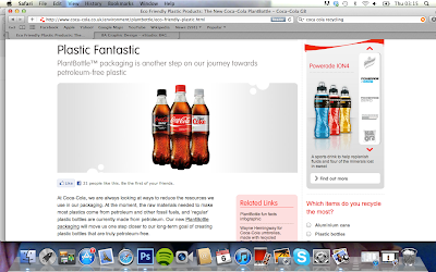
"At Coca‑Cola our packaging innovation teams continually explore new ways to reduce the amount of material and energy used in our packaging, without sacrificing quality. All of our major packages have seen significant material reductions since their initial introductions.
We are now focused on increasing the amount of recycled materials in our packaging, especially our PET plastic bottles. The recovery of used packaging is an important step in meeting this goal, which is why Coca‑Cola is the first drinks company to have introduced branded Recycle Zones across the country to help consumers recycle more when they're out and about.
We've worked with organisations such as WRAP and Recoup to make sure the Recycle Zones are as effective as possible. These zones give consumers a convenient set of recycling units to put their empty bottles and cans into when they're on the go. The bottles and cans will then be collected for recycling.
Our biggest Recycle Zone is at Manchester Airport, which has around 150 units. In total there are currently over 80 Recycle Zones placed everywhere from the London Eye and Center Parcs to Exeter University and Crossgates Shopping Centre, Leeds. For more information, please visit the Recycle Zone website."


Did you know.. A survey carried out by
Coca-Cola found that 97 percent of 
Londonders thought that recycling
was hampered by a lack of facilities?


Coca-Cola and ECO Plastics collaboration 

  • Currently, Coca‑Cola sources recycled plastic from Europe, while around two-thirds of used Great Britain plastics packaging is exported for reprocessing
  • Used British packaging will be recycled at this new recycling plant for re-use in packaging that will then be sold right here in Britain
  • Around 35,000 tonnes of PET (polyethylene terephthalate) plastic bottles were reprocessed in Great Britain in 2010 - our new facility will increase this total to more than 75,000 tonnes (when it is fully operational)
  • This will more than double the amount of high-quality recycled rPET (PET that is recycled to make food-grade, sustainable packaging) currently produced in Britain
  • The facility will also supply Coca‑Cola with enough locally-sourced, high-quality recycled plastic to achieve our target of including 25% recycled plastic in all our plastic packaging by 2012