Showing posts with label Design for Print. Show all posts

Thursday, 16 January 2014

OUGD504: End of Module Self-Evaluation

1.  What skills have you developed through this module and how effectively do you think you have applied them?
Throughout this module, I have pushed my creativity further than any other previous brief. During the design for print initial idea process, I was adamant that I wanted to push myself into new process areas, exploring techniques I was less confident with. The result of this has been great! Over the course of this module, I have begun to understand the basics of flocking, foiling, screen-printing and laser-cutting in this one project alone. In addition, I have surprised myself by completing a four-page website in Dreamweaver. After no previous experience in Dreamweaver, and only being given three Web Design Sessions with Simon, I was convinced I would stand no chance of understanding code. Although I was not pleased with the final outcome of my website (aesthetically), I was pleased that I was able to prove to myself I was capable of mastering the basics of coding, linking and managing a website. This is a skill I would like to improve, as it would be a large bonus for self-promotion and broadening my design capabilities.


2. What approaches to/methods of design production have you developed and how have they informed your design development process?
I have taken a much more hands-on approach throughout this module. I have developed skills within InDesign, Illustrator and Dreamweaver. I am still reasonably new to all of these programmes, but I have tried to push myself to overcome new design challenges, such as designing my print publication without seeking help from others. This has really helped me to understand the fundamentals of each programme. Although at times I was unsure how to resolve certain problems, I tried to remain patient and figure out the most logical and reasonable solution. From tackling these briefs as independently as possible, I now feel less inclined to depend on others. This definitely helps to save time and speed up my design development process.


3. What strengths can you identify in your work and how have/will you capitalise on these?
I am beginning to take a lot more pride in my own work. Whereas before, I would usually feel shy or reluctant to present my work to other people, I currently feel more inclined to share my ideas and development. Any form of response towards my work, whether it is positive or negative is usually constructive and I have been really pleased with most of my recent feedback. The confidence in my ideas has definitely started to have a noticeable effect on my work. I have become more organised, although I still need to improve my time management. 


4. What weaknesses can you identify in your work and how will you address these in the future?
Due to poor planning, I was not able to produce as many outcomes as I would have liked for the 'Design for Print and Web' brief. I wanted to print and produce a lot more physical outcomes such as napkins, order pads, name badges and posters. However, as I did not allow enough time for these, I was only able to create menus and invitations to an opening night. As I was aware of this from halfway through my development, I decided to focus my attention on producing the menus and invitations to their best potential as opposed to rushing the production of everything else to a standard I was not pleased with. Another reason for running out of time on Brief 3 was dedicating the majority of my time to Brief 1 (Design for Print). On the plus side, I was really pleased with that outcome. My print publication was probably my favourite outcome of the three and received a lot of positive feedback from my peers.


5. Identify five things that you will do differently next time and what do you expect to gain from doing these?
1. Manage my time more carefully to produce an even balance of successful outcomes. 
2. Seek more advice from my peers to better justify my design decisions.
3. Develop my ideas more concisely through design boards, thumbnails and mockups.
4. Speak to people outside of the course to get a broader range of feedback.
5. Generally work at a faster pace.


6.How would you grade yourself on the following areas: 
5= excellent, 4 = very good, 3 = good, 2 = average, 1 = poor

Attendance
5

Punctuality
4

Motivation
3

Commitment
4

Quantity of work produced
3

Quality of work produced
3

Contribution to the group
3

Friday, 20 December 2013

Design for Print: Novelty Inks and Printing

Novelty Printing Through the 5 Senses
graphicartsmag.com


SIGHT: Seed Paper
Seed paper, like varieties available at Botanical Paperworks (www.botanicalpaperworks.com), is an innovative paper technology whereby seeds are embodied within handmade paper products. Once the paper is used for its intended purpose (business cards, promotional items, wedding initiations, etc.) it can be planted and watered to produce new life. The paper itself is handmade from post-consumer waste, and once its expected life as a printed product is over, all that remains are beautiful flowers, herbs or vegetables. It is a sustainable process that leaves behind no waste. The paper products sold by Botanical Paperworks can be passed through a home inkjet printer, increasing opportunities for consumer end use.


TOUCH: Personalized Flip Books

Personalized flipbooks are amazing little keepsakes that capture favourite memories. There are several online printers who provide this service and create customized, variable data flipbooks. Customers simply upload a short video they want to capture and image stills are extracted, printed and bound into book format. The price is right too, with some flipbooks selling for under $15 (like the ones at flipclips – www.flipclips.com).


TASTE: Edible Inks and Papers
Everyone loves a tasty piece of cake… even more so if they are eating a picture of their own face! Edible inks and papers are used mainly by the baking and confectionary industries for commercial use creating unique cake designs. The edible paper can be passed through an inkjet printer and it can be made of rice paper or, alternately, a sugar and starch combination. The ink consists of food colouring that dyes the edible paper in the same way that inkjet ink would be deposited onto a sheet of paper. Edible papers have very little flavour or texture, and are therefore perfect for this application as they almost “melt” into the icing on top of the cake. The resulting effect appears as though the image has been printed directly on the iced top of the cake. Any inkjet printer can be used to facilitate the printing of edible ink onto the edible paper, however the resolution of the output device must be taken into consideration when aiming for a high quality end product.


SMELL: Canadian Tire’s Scentvertising
Here’s a new take on an old process! In a series of full-page Canadian home magazine advertisements, Canadian Tire harnessed the power of “scentvertising”. They employed visually appealing ads, printed on traditional perfumed peel-back scent flaps, with aromas such as “freshly mowed grass” and “charcoal barbeque”. On the back of the advertisements were coupons for products to get ready for spring. This clever ad provides an innovative sensory experience to get consumers excited about spring-related products at Canadian Tire.


SOUND: The Paper Record Player
Kelli Anderson is a Brooklyn-based designer and artist who works with a variety of media including photography, digital design and print. (She even has her own letterpress from 1919 housed in her apartment!). One of her recent projects is “The Paper Record Player” and I had the pleasure of speaking with Kelli about this project.

“The Paper Record Player” is a feat of paper engineering that is not only functional, but also captivatingly beautiful. It was designed and created for a friend’s wedding invitation, where recipients received a neatly packaged booklet that, when opened, morphed into a self-contained record player made almost entirely of paper.

“Part of The Paper Record Player’s charm is the awkward, handmade feel. People feel like they can mess with it and use it with their hands.”

The record itself was a flexidisc (a thinner and cheaper alternative to vinyl records that were manufactured at Pirate Press in San Francisco), however the needle arm, turntable base and booklet structure are all comprised of paper. A simple set of three instructions guided invitees to fold the paper record arm so that the (sewing) needle could make contact with the record at a 90-degree angle. Once the needle makes contact, the user then spins the record manually at 45 rpm to hear the song play. There is no speaker or added amplifier contained within the record player. The folded, thin paper arm facilitates vibration allowing the sound to be naturally amplified through this crafty device. All pages of this piece were simply sewn onto the cover stock, binding all components together.

The project took a period of four months to complete from original concept to the accomplishment of 200 printed and assembled copies. Lots of prototyping took place during this time and a few paper engineering-specific issues cropped up. One issue involved unwanted friction produced from manually spinning the disc on the inside back cover, thereby creating excess noise. Kelli’s clever solution was to laminate the back cover to reduce friction and therefore reduce the noise.

When Kelli was asked if she would venture into another paper engineering project, her response was a resounding, “Yes, absolutely! But I have to recover from The Paper Record Player first.”

Check out the record player in motion: http://bit.ly/ghRyow .

You can find Kelli on the web at www.kellianderson.com.

These and other innovations in novelty printing are exciting for the graphic communications industry and push the boundaries of how we understand print to exist in our everyday lives. Whether you see printed matter on a page, feel it in the form of a print-on-demand flipbook, taste it in your birthday cake, smell it in a magazine or hear it in a wedding invitation, there are so many interesting ways to interact with printed pieces.


Invisible inks
uk.games.yahoo.com

So how do you do it? Depending on the security you need, the materials you have, and the amount of time and effort you want to put in, there's a variety of options. Almost any kind of acid will work as invisible ink, as long as it dries clear: gently warm the paper (over a hot light bulb, say) and the heat will oxidize the acid, revealing the hidden message. Lemon juice, vinegar, wine, and milk are all easy-to-source choices.

But that's not going to do a great job of keeping your secrets; applying heat is the first trick an enemy agent will try. More complex inks exploit chemical reactions to do their developing. Write your message in a clear substance, then later coat the paper in a special developer that sparks a chemical reaction, changing the color of the ink and revealing your scrawls. These are harder to improvise at home, though red cabbage water (the liquid left behind after you boil red cabbage) serves as a developer for a number of household chemicals including ammonia and lemon juice, and iodine does the same for starch.

Other invisible inks only show up when they fluoresce under a blacklight. Bodily fluids work here, though in the interests of hygiene we don't advise too much experimentation. Laundry detergents usually contain optical brighteners that will serve the same purpose, though, and commercially available security pens are also worth a go.


1.Lemon Juice


Lemon juice is a great example of a ‘heat-fixed’ invisible ink. An invisible lemon juice message, scrawled onto a piece of paper, can be developed by exposure to any heat source such as a radiator, an iron or a 100W light bulb.

Many acidic household liquids (Coca Cola, wine, apple, orange and onion juice included) behave in quite the same way, as do a number of bodily fluids. During the Nazi occupation of Poland, people frequently sent postcards containing hidden messages written in saliva and even urine.

Equipment & ingredients: you’ll find them in most local grocers

Suitable for:
anyone

Ease of use: really easy


2.Vinegar

Vinegar is another household liquid that can be used as an invisible ink. Unlike lemon juice, messages written in vinegar are best developed by a chemical reaction. Red cabbage, which contains a pigment called flavin (an anthocyanin), can be used in solution to develop vinegar and other strong acids. Red cabbage solution turns a vinegar message dark red.

Equipment & ingredients: ubiquitous

Ideal for: anyone wanting to hide a message

Ease of use: simple

3.Cerium Oxalate


In 2006, two researchers from Michigan State University finally discovered the secret behind the Stasi’s invisible ink. The Stasi would sandwich a piece of material impregnated with cerium oxalate between two sheets of paper, writing on the top sheet to transfer a chemical message onto the sheet below. A solution of manganese sulphate, hydrogen peroxide and other chemicals could then be used to develop the message, turning it orange.

During World War II, numerous chemicals were used as invisible inks: copper sulphate, developed with sodium iodide; iron sulphate, developed with sodium carbonate; and sodium chloride (common table salt), developed with silver nitrate, were some of the more common. The search of one Nazi spy’s hotel room uncovered several large and unusual looking keys, which turned out to be invisible ink writing implements, with hidden nibs and chambers for ink.

Equipment & ingredients: access to a lab would help

Ideal for: anyone wanting to hide sensitive information

Ease of use: time consuming

4.UV

Specially formulated UV inks are invisible in daylight, but glow under UV light sources. UV pens filled with such inks are used to mark items in case of theft, products in manufacturing and hands or tickets for readmission to events, particularly at nightclubs.

Many common substances, from laundry detergents to soap and bodily fluids, can be used as crude invisible inks, as they fluoresce under UV light. Photocopiers can be used to develop messages written in these inks, due to the UV components in their scanner heads.

Equipment & ingredients: easy to pick up UV lights and pens

Ideal for: hiding information at school or work

Ease of use: simple and reliable

5.Printer Ink

Invisible UV ink is also available for use in printer cartridges and is used for printing information onto business forms, so as not to clutter the visible content. The United States Postal Service also uses UV ink to print barcodes and routing information onto mailed envelopes.

By following the instructional video above, you can make your own makeshift invisible inkjet printer cartridge with just an ordinary inkjet cartridge, four invisible ink pens and a syringe. One little tip: make sure you wear gloves!

Equipment & ingredients: easily sourced from most electronics stores

Ideal for: home and office use

Ease of use: ridiculously

6. Pure Distilled Water

When there’s nothing else around, even water can be used as invisible ink. Writing a message in water disturbs the surface fibres on a piece of paper. Such a message can then be developed using the fumes from heated iodine crystals. The marks made by the water turn brown, as iodine particles stick more readily to disturbed areas. This method is not perfect however, as exposure to direct sunlight or bleach can erase your message completely.
7. Disappearing Ink

Disappearing ink is unlike any other ink in this list: it begins visible, but soon disappears. The normally colourless thymolphthalein, which turns blue when mixed with the base sodium hydroxide, is a great example. Over time, the base reacts with carbon dioxide in the air and its pH drops. Once it ceases to be a base, the blue colour disappears. Ink like this is used by events managers on non-reusable passes – and by practical jokers in their water pistols!

Equipment & ingredients: thymolphthalein may be tricky to source

Ideal for: good for using on single-use, time-sensitive identity cards

Ease of use: once setup, it’s easy

Read more about 7 Amazing Types Of Invisible Ink & How You Can Use Them Cartridge Save Blog by CreativeCloud from the UK's leading supplier of printer cartridges

Sunday, 1 December 2013

Content Reseach for Print Publication

graphicdesign.about.com

Audience
When beginning a project, it is important to think about the experience of your audience, which differs greatly between print and web design. At the most basic level, the web is interactive and print pieces are usually not.

In print, you are trying to get your audience to stay on a page long enough to get a marketing message across. You are often faced with a limited area in which to achieve this, such as a one-page magazine ad. In some cases, you are trying to catch their attention and have them dive deeper into your product, as with a book cover or the first page of a brochure. One of the benefits of print design is that you are dealing with a physical product, so physical properties such as texture and shape can help you achieve your design goals. As an example, paper companies will take out magazine ads printed on their own paper, allowing the audience to feel the weight and texture of their product.

Layout
  • In print, your space is generally measured in inches.
  • You can be dealing with anything from a business card to a highway billboard.
  • You know the space allowed from the start and that your finished product will look the same to everyone who sees it.
  • You must have bleed and safety areas to guarantee print results.

Colour
  • Consider the difference between your colors on screen and on paper.
  • Again, a “proof” can help ensure you are getting the desired results.
  • You often choose “spot” or “process” colors for your printer to use. These are colors you choose from a palette and identify with a code that you provide to your printer.


It is important to prepare and design your documents correctly to ensure that the final PDF will output correctly and to the best quality. This page highlights some of the main issues to be aware of when designing for print.

Colour space
Files intended to print in four-colour process should be supplied in the DeviceCMYK colour space, and contain only cyan, magenta, yellow, and black. Any objects in RGB, calibrated RGB or LAB must be converted before being imported into your layout application.

Total Area Coverage (TAC)
Combined colour values should not exceed 300 per cent. This may be required to be lower depending on the paper being printed on. This TAC applies to pictures printed in colour - 300 per cent in the darkest areas.

Image specification
Resolution and size
Colour and greyscale continuous-tone images should be saved at 300dpi at a print size relevant to its final size on the page. Bitmap images (linework) should be saved at at least 1200dpi and preferably 2400dpi. Resolutions lower than this or images smaller than the final size on the page will lead to a loss of quality.

Format and Compression
Ideally, images should be saved as TIFFs, but JPEG compression can be used to reduce file size. I do not recommend the use of RAW files from digital cameras or PhotoShop .psd files as results can be unpredictable if not properly handled.
JPEG compression is a "lossy" format where pixel information is thrown away to reduce file size. Algorithms rebuild the discarded data when the file is decompressed. LZW compression within the TIFF format is a lossless method, replacing repeating code with a tag which is replaced when the file is decompressed.

Vector graphics
Files originated in vector-based illustration software such as Adobe Illustrator should have all fonts embedded or outlined. The colour space should be CMYK and all transparency must be flattened.

Placing graphics
When you place pictures in your layout application allow a "safety margin" between the edge of the picture box and any part of the image that is not meant to appear. This will avoid "rebates", particularly noticeable when you place keylines around your images.

Fonts
Do not style fonts bold and/or italic using the styling buttons in your layout application. Always select the styled version of the font from the font list. If this is not possible, remember that not all fonts have bold and italic versions.Your screen does not recognise this and will display them regardless of whether italic or bold printer fonts exist (common examples are symbol fonts such as Zapf Dingbats or Symbol, for which there are no italic or bold printer fonts). With no associated printer font, a styled screen font will output unstyled, as the default font or not at all. Do not trust your screen - always check that Printer fonts are available before styling bold and/or italic
Outline and shadow text created by style menus should be avoided. Most desktop printers will not successfully show the final printed result, and you may get unexpected or undesirable results.

Fine lettering
Thin lines, rules, medium and small type sizes should be reproduced at 100% (solid) of only a single colour wherever possible.
Do not use rules defined as "Hairline" in your DTP application. Desktop printers and similar devices will not give an accurate representation of a hairline rule on your proofs.
Keep to a minimum rule weight of 0.25pt for a solid single colour.

Reversed out lettering
Reversed 1-1 out lettering, or knocked-out type, should be out of a minimum of colours. Type or objects smaller than 10pt in size should ideally be reversed out of one colour only. Small letters reversed out of multiple colours - particularly fonts with fine serifs - will show colour in white type areas even with the slightest mis-registration on press. Check to ensure that reversed-out lettering does not become illegible due to the text's background.

Tints and backgrounds
If you wish to reproduce a large solid black background I would recommend that the black prints at 100 per cent, along with a 40 per cent cyan tint to provide more density. This is often referred to as a "shiner", and produces what is sometimes called a "rich black".
The inclusion of a common colour background or strap heading across several pages of a feature or sections of a magazine can draw attention to the natural minor variations in colour balance that occur across a press/presses and during a press run. This can be minimised by creating these common colours out of as few process colours as possible. Give careful consideration to the use of one, or perhaps two colours to produce the common colour. Such a colour will enable a more consistent reproduction than the same object defined using all four process colours. However, certain two-colour combinations can also be prone to unattractive colour shifts - particularly when both colour values are midtones. Two-colour combinations where one colour is considerably higher than the other prove more stable, producing a more consistent, balanced result.
To assure accurate reproduction on press it is advisable to supply a colour swatch or contract-colour proof.

Tracking

Tracking occurs when ink is consumed by an area of a sheet with a high percentage of one or more colours, creating a deficiency of that colour within a later area running in track. This effect is more evident on heavy tint areas running across the sheet. To avoid the effects of tracking it is important to consider the final imposition and design your layout accordingly.

Black overprint
100% black elements will automatically overprint other colours. This prevents normal black text knocking "holes" in tints. Therefore, it is important that larger 100% black page elements, such as boxes or very large point size text, do not have variations in colour beneath them. These will show through in the printed page. Alternatively a "shiner" (see above) can be used to produce a heavier, more consistent solid. If a black element is overprinting a four-colour image, include at least 1% pf CMY in your black to ensure the picture does not show through the black.

Trims and Bleeds
All page content that runs to the edge of the page must extend off the page by a minimum distance of 3 mm. This minimum distance is referred to as bleed. If bleed is not applied there is a risk of an unsightly white area appearing at the bleed edge.
Elements that do not bleed should be a minimum distance of 5 mm from the edge of the page. This is referred to as the margin. Elements closer to the edge than this standard risk being trimmed off during the finishing process.
Do not attempt to place text sitting exactly on the trim - you will almost certainly be disappointed with the finished trimmed result.
Consideration should be given to the binding style when setting the margins.
For perfect-bound titles consideration should be given for the area in the backs lost in the spine glueing.
For wire-stitched titles remember that larger paginations cause "bulking" resulting in the centre pages of the magazine being considerably shorter in width than the pages at the front and back. The uneven fore-edge is trimmed away after it is stitched. You may wish to allow a larger fore-edge margin in such cases or a larger margin in the backs to allow for "feathering" at the imposition stage. Pages that read across the spine cannot be feathered so attention must be paid to the fore-edge to avoid important content being trimmed away. Check with your Production Controller at Headley Brothers for advice on how to proceed.


Particular attention must be paid to the covers of perfect-bound magazines. The cover is glued along the spine and attached to the first and last page of the contents and can lose an area of around 6-8 mm in the "hinge". Check the Downloads Page for the PDF "DPS For Covers Template" that will guide you in dealing with this.


Perfect Binding
Paginations below 56 pages are not suitable for perfect binding. Depending on the weight and bulk of the paper, fewer pages than this do not produce a spine of a viable width for the perfect binding process. Please consult your Production Controller for advice.

Elements across spreads
Accurate alignment of elements that go across a spread cannot be guaranteed. Items that can look bad across spreads on a final printed result are: rules; tint edges (especially diagonals); text and lineart. If it is necessary to run a line of text across a spread make sure the spine falls between words.
This is even more evident in perfect-bound titles which cannot be opened out flat. There is always a certain amount of the page in the backs that cannot be seen. To overcome this, pages which cross a spread should be "thrown out". Check with your Production Controller at Headley Brothers for advice on how this is achieved.

Ink Rubbing

Ink can be transferred through abrasive contact on press and bindery handling systems during the manufacturing process. Matt and silk/satin papers are particularly susceptible to ink rubbing. Consideration can be given to this at the design stage. Where possible avoid facing pages of heavy ink coverage against white, unprinted pages.
Where possible avoid designs where the outside front cover is heavily inked and the outside back cover has large areas of white space or vice versa.
If this is unavoidable, consider a seal, which can sometimes prevent marking.

Web growth
Paper has a tendency to expand as it absorbs moisture and shrink when it loses moisture. In the heatset web offset process heat is applied to the paper in order to flash off solvent and dry the ink. After heating the paper is cooled, and a layer of silicone emulsion is applied to "recondition" it. The heating of the paper removes a percentage of the moisture content which cannot be replaced in the printing process. The width of the web will have reduced by several millimetres when it leaves the press, which results in about one millimetre of shrinkage per page.
In sheetfed printing the opposite occurs. Paper takes up water in the printing process and may stretch due to water absorption.
When sheetfed covers are bound with web offset sections, the covers are trimmed flush with the inner sections. After the trimming the covers release moisture into the air and the web offset sections absorb moisture from the air. The covers may shrink slightly and the web sections will grow and hence show a difference in size. Since the industry-accepted best-practice is to run paper grain parallel to the spine, web growth beyond the sheetfed cover will normally be evident on the fore-edge.
This effect is common within the printing industry and is most often seen when sheetfed covers are bound with web offset sections.
It may be possible to minimise the impact of this effect by careful design of the cover and page one of the content. Speak to your Production Controller at Headley Brothers for advice.


designdisease.com
How Printing Works
To start off, a basic knowledge of how different types of printing work, while not necessary, will help you understand what it is you are doing when clicking that ‘print’ button.

There are many types of printers: laser jet, bubble jet, thermal printers, inkjet, etc. Inkjet printing is probably what you will come across and use the most. Inkjet printers use liquid ink to form the images you print. Usually inkjet printer will contain either ink cartridges or ink tanks, the difference between the two being that ink cartridges have inbuilt print heads while ink tanks are simply a container.

The ink is “sprayed” or dropped onto the page drop by prop by the printheads, building up the image you are printing
CMYK and DPI


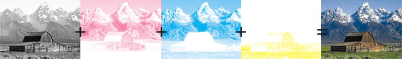
One of the most important things to understand is how colours work when printing. Your basic inkjet printer usually will use 4 cartridges: one black, one cyan, one magenta and one yellow, CMYK. Using the CMYK colour model, the printer can lay down a combination of cyan, magenta, yellow or black creating pretty much any colour you would need. White is not needed and in a way is simulated by a lack of dots of colour, showing the white paper behind it, creating either white or a light colour.

When designing for print it can be best to make sure you either design or convert to CMYK before printing as colours will appear differently than when using RGB, but we’ll talk more about that later.


Another important factor is resolution and DPI. What resolution you design and print at really depends on how high quality you want the image to be and what sort of limitations your printer has. Due to printers having the limitation of only using 4 colour cartridges, the DPI has to be considerably higher than when displayed on a monitor to be able to replicate the more complex colours. When designing for print, for example the minimum DPI (dots per inch) for a magazine or leaflet will usually be 300, all though the higher the resolution the better the image will look.
Designing For Print

Designing specifically for print is not the same as designing for digital and web use, in fact it can be a little complicated.

As mentioned before, traditionally, when designing for print you should use CMYK, and this is still the case when using top end printers. The complicated part is that a lot of modern day inkjet printers don’t actually accept CMYK data, even if you send a file to print from photoshop with a CMYK colour mode, the printer will convert any data sent over into and RGB colour mode. So it’s hard for me to tell you what mode you should be designing in as it will be different with each printer you use.


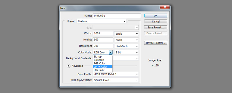
Personally when starting a new document for print, I would recommend going with RGB anyway in the first stages of design. The reasons behind this being: RGB file sizes are smaller, some filters and effects don’t work when in CMYK and RGB has a larger colour range. Then once you are ready to print, convert to CMYK if your printer specifies that it can receive CMYK data, the only down side to this being a slight colour loss/change which you will be able to correct.

Now when it comes to DPI settings it is pretty simple. 300 DPI will almost always be as high as you need to go when designing for print. At this resolution, the human eye cannot distinguish between the dots from a regular reading distance, having a higher resolution would usually be pointless.

If printing something that will not be viewed up close, such as a poster or banner, the resolution can be lower, usually around 150 – 200 DPI is good. When designing for something much larger that will be viewed from further away, for example a large billboard, it is common for the resolution to be as low as 12 – 15 DPI.

With some of the larger prints you are probably not printing it yourself, so it’s always good to ask what sort of resolution and colour mode the printer requires.


Paper Stock
www.bbc.co.uk

Paper thickness is measured in grams per square metre (gsm). This is the weight of one square metre of the paper.

Most paper is manufactured from recycledboards and paper. Virgin paper is made from 100% wood pulp and contains no recycled material.

Different types of paper and board have different uses, as shown in the table below:
Types of paper and their uses

Type, Description and uses

Layout paper
- lightweight, thin white paper
- used for initial ideas
- takes colour media well
- low cost

Tracing paper
- thin, translucent paper
- making copies of drawings
- high cost

Cartridge paper
- good quality white paper
- available in different weights
- general purpose work
- can be used to make simple models
- medium cost

Bleedproof paper
- smooth, hard paper
- used with water-based and spirit-based felt-tip pens
- medium cost

Coloured paper
- many different types
- available in different thicknesses
- used for mounting finished work
- used to apply coloured surfaces to models
- low to medium cost

Grid paper
- printed square and isometric grids in different sizes
- a guide for quick sketches and model-making
- low cost


Print Processes
www.howstuffworks.com

There are nine main types of printing processes:
  • offset lithography - what we are exploring in this article
  • engraving - think fine stationery
  • thermography - raised printing, used in stationery
  • reprographics - copying and duplicating
  • digital printing - limited now, but the technology is exploding
  • letterpress - the original Guttenberg process (hardly done anymore)
  • screen - used for T-shirts and billboards
  • flexography - usually used on packaging, such as can labels
  • gravure - used for huge runs of magazines and direct-mail catalogs

www.treetopdesignandprint.com
Print processes explained

Lithographic Printing
The main printing process used throughout the world and encompasses a number of different terms including:

Offset Printing, Litho, Sheet Fed, Web Offset, Continuous.

It is a planographic process where the image and non-image are on the same flat printing plate. The image areas are processed to accept ink and repel water. The non-inage areas are processed to accept water and reject the greasy ink. So by wetting the plate and then inking it, the image area is able to transfer the ink to a blanket cylinder and then from there to the paper (the offset principle). The printing plate never comes into contact with the paper.

Litho plates are made by a variety of methods but most modern print factories use computer-to-plate (CTP) systems which are created direct from the computer files rather than having to output film first.

Digital Printing
Is primarily used for short runs of less than 1000 or for items that need to be individually personalised with text and/or images. Digital printing requires less set-up than other methods but does not gain from economies of scale.

Digital printing uses a dry ink process where the ink does not permeate the paper unlike wet ink. The dry ink is held in place by applying a layer of fuser oil and a heat process.

Large Format Printing
This process uses inkjet printing machines that can print widths up to 3.5m and virtually any length. Large format printing is usually used to produce short run posters, banners and point of sale material and the end results can be lightfast and permanent.

Silk Screen Printing
This process uses a stencil which is mounted on to a fine screen material. The ink is passed through the stencil and screen onto the substrate.

Screen printing can be used on virtually any substrate and any shape using any kind of ink.

Flexography
This process uses a rubber plate and very thin inks and is similar to the original letterpress printing techniques. This is a specialist process and is used most commonly on plastic carrier bags.

Gravure Printing
This process uses an engraved image which is flooded with ink and the surplus is scraped off with a blade, the plate is then pressed onto the paper. This process can produce very intense colour on very low grade paper and so is a popular process for long runs like Sunday newspaper supplements.

Monday, 18 November 2013

Design for Print: Book-binding Research

Perfect Binding
  • Perfect Binding is a widely used soft cover book binding method. With this binding method, the pages and cover are glued together at the spine with a strong yet flexible thermal glue. The other three sides of the book are then trimmed as needed to give them clean “perfect” edges.
  • The many soft cover books that you see on the shelves at bookstores are good examples of perfect bound books. They have a square, printed spine and the cover is usually made from paper or cardstock that is heavier than the interior pages. Plus, the cover is often clear coated to provide durability and improve appearance. In addition to authors, businesses and organizations use the perfect binding method on a variety of printing projects because of its professional appearance and relatively low cost. 
  • Perfect binding is commonly used for annual and corporate reports, manuals, catalogs and thicker product brochures.
Benefits of Perfect Binding
  • The primary benefits of perfect bound books are that they look professional and offer visual appeal, are less expensive to produce than hardcover books, and they stack well. Also, the square spinal edge formed by the perfect binding method allows for the book’s title or other information to be printed on the spine…something the saddle stitch and spiral binding methods do not offer.
  • In addition, perfect bound books can be printed in Short Runs and are a great candidate for On Demand Printing. This provides tremendous benefits to book authors as well as cost-conscious businesses and organizations.


PUR Binding
  • The fundamental difference between the two types of binding is the adhesive used in the process. Perfect binding uses ethylene vinyl acetate (EVA) adhesives whereas PUR uses polyurethane reactive (PUR) adhesives. Put simply, the binding really only differs by way of the type of glue used. It is the properties of each type of adhesive, however, which is important in determining which is suitable.
  • A key reason PUR adhesive is often the preferred choice is due to its excellent flexibility and ‘lay-flat’ qualities. The benefits here are two fold. Firstly, due to PUR requiring a smaller layer of adhesive when compared to perfect binding, it allows even the thinnest of books (a minimum of 3mm is still recommended) to maintain a square and rigid spine. Secondly, when applied to standard thickness, PUR glue affords considerably more flexibility and pliability than EVA, which allows books to demonstrate lie flat characteristics. This in turn minimises any spine cracking when the finished product is ‘flattened’ out for reading.


Wire Binding
  • Wire binding is one of the most popular commercial book binding methods used in North America and is known by a number of different names including twin loop wire, Wire-o, double loop wire, double-o, ring wire and wirebind. With this binding method, users insert their punched pages onto a "C" shaped spine and then use a wire closer to squeeze the spine until it is round. 
  • Documents that are bound with wire binding will open completely flat on a desk and allow for 360 degree rotation of bound pages. 

Wire-O Binding

Semi-exposed Wire-o binding

Reversed/concealed wire-o


9/16" Black Spiral-O 19 Loop Wire Binding Combs - 102pk. Spiral-O 19 Loop Wire Spines are designed to work with any 19-ring plastic binding system that will accept Wire Bindings. These wires are designed specifically for use with older Ibico Ibimaster binding systems that included a comb binding punch along with a wire closer. - link

Wire binding machine


Saddle Stitching
  • A saddle stitch is appropriate for small booklets and, in general, for volumes with only a few pages. Most magazines that are not glued are saddle stitched: that is, they are held together by staples that run through the gutter. Once the pages are aligned and in the right order, this type of binding is quite straightforward. Staplers with extremely long jaws, designed specifically for saddle stitching, are available in office supply stores. Some photocopiers produce saddle-stitched volumes automatically.
  • If neither of these options is readily available, an improvised saddle stitch can be accomplished by using an ordinary stapler in "tacking" mode. This usually requires swinging the anvil away from the bottom, or detaching the lower jaw of the stapler. The working surface should be reasonably soft and durable, such as carpeting or a cork board. Staples can be driven through the centerline of the pages to be bound, and then bent down individually using the cap of a pen.
  • Saddle stitching can also be done to the individual codex, using a needle and thread, as part of the process of binding them together into a larger book.


Plastic Comb Binding
  • similar to wire spiral binding, comb binding is a method of securing loose printed pages using a piece of plastic with "teeth" (the comb) that fit into rectangular holes in the paper. 
  • The combs come in different colors and widths to accommodate small and large numbers of pages. Documents can be bound with or without covers. 
  • The binding allows books to lay flat when opened.


Spiral Binding
  • Spiral binding, also known as coil binding, is a commonly used book binding style for creating documents, reports, presentations and proposals. This binding style is known by a number of names including spiral coil, color coil, colorcoil, ez-coil, plastic coil, spiral binding, plastikoil and coilbind. 
  • Documents bound with helical coil (usually called spiral coil) can open flat on a desk or table and offer 360 degree rotation for easy note taking. 
  • This binding style is durable and is often used for documents that need to be mailed. Spiral coil binding spines are also available in more colors and sizes than other binding styles.
Rhythm flipbooks to make a variety of different rhythm patterns quickly without lots of flash cards.
Bind your own


Above: Fully bound so only the covers are accessible,


Lay Flat Perfect binding
  • A variation of traditional perfect binding is called Lay Flat binding The cover is glued only to the sides of the spine so that a perfect bound book can lay flat when open. 
  • A strip of gauze is glued to the spine edge of the book block to hold the signatures or pages together. This allows the book block to “float” over the spine and lay flat when opened. 
  • In traditional perfect binding, the cover is actually glued to the spine of the book which means the book will not open as far as a lay flat book.


Japanese Stab Binding
  • This technique is ideal for binding single sheets of paper in soft covers and can be used for diaries, class notes, phone messages, recipes, and school or business reports. Most types of papers-handmade, commercial or tracing papers, even acetate can be used for Japanese stab binding. If the book will contain writing, the paper must be smooth.
  • Inexpensive photocopy paper is also fine for text pages, and has the added benefit of being readily available and cut to a standard size. 
  • Cutting is not required for this technique, which makes it suitable for both young and beginner bookbinders.

'Cuts' (2010) Handmade Japanese stab bind book.


Coptic Binding

Perspex book cover, hand bound

Einar Guðmundsson - 0.01%

'Master Conclusion Book Design'


Useful Links:

Monday, 4 November 2013

Design for Print Reseach

PRINT PROCESSES:

TECHNIQUES
www.printshop.org

The listings below describe the principal techniques in traditional and contemporary printmaking. Each of the various methods of printmaking yields a distinctive appearance, and an artist will choose a technique in order to achieve a specific, desired effect. Artists may, and do, combine different techniques. Since some modern techniques are quite complicated, some artists collaborate with a master printer to help create the final work.

There are variants of these techniques (for example, crayon-manner engraving, stipple engraving, soft-ground etching) and combinations of techniques (etching and aquatint, lithography with pochoir coloring). There are also additional techniques, such as embossing, gypsography, sulfur tint and roulette, which have been used at specific times and places or in combination with other techniques. Finally, there are photo-reproductive techniques, such as heliogravure, gillotage, collotype, photo-lithography or photo-etching, the products of which are generally not considered to be original prints, but which may on occasion have been used in combination with other techniques to produce an original work.

RELIEF PRINTING
In this technique, the artist sketches a composition on a block of material and then cuts away pieces from the surface, leaving a raised area which will receive the ink. A roller is then used to apply ink to this raised surface and the image transferred to paper with a press or by hand burnishing or rubbing. Since the recessed, cut-away areas do not receive ink, they appear white on the printed image. Relief prints are characterized by bold dark-light contrasts and an impress into the paper of the inked lines. They primary relief techniques are woodcut, wood engraving, and linocut.

Woodcut is the earliest and most enduring, in that it is still practiced, of all print techniques. While woodcuts were first seen in ninth-century China, Western artists have made woodcut prints since the fourteenth century. They were originally conceived as religions icons and sold as souvenirs of a pilgrimage to some holy site. Woodcut soon became a popular medium for the mass distribution of religious and instructive imagery in Europe, not least through books since, with the invention of movable type, the woodblock matrix could be set in the same press with the text and both text and image printed together. In the seventeenth and eighteenth centuries, woodcuts were developed in Japan to an exceptional level of artistic achievement, what is known as the ukiyo-e period or style.

Wood Engravings are made from the end-grain surface of very hard wood, usually boxwood, as opposed to woodcuts, which are made from side-grain planks of wood neither so hard nor so expensive. Rather than cutting away non-printing areas with a knife, wood engravings are made with fine engraving tools which are used to engrave the non-printing areas with incredible precision and detail. As in woodcuts, it is the surface that takes the ink and prints.

Mei Chen Tseng. Isabella and the Pot of Basil 2008.

Tall Trees - Sue Scullard
Robert Smith - Badgers


Chiaroscuro Woodcuts involve the use of several blocks, often one for each color to be used and sometimes one to outline the composition of the image. The print is made by printing a sheet of paper with each of the blocks in turn, using some method of registration to avoid misplacement or overlapping. Where a non-printing area has been cut out of all the blocks, the natural white of the paper shows through in the finished print, giving the reason for the name Chiaroscuro (Light-Dark). Usually no more than three or four locks are used and the purpose of the technique is to imitate the appearance of a wash drawing, not to attempt to capture reality.

Albrecht Dürer - Lamentation - 
chiaroscuro woodcut using two blocks 1498

Jan Lievens (1607-1674) Bust of an old man, 
full face chiaroscuro woodcut, 1630-40


Color Woodcuts, a product of the nineteenth century in the West, use the same techniques as chiaroscuro but often carried to enormous complexity of multiple blocks and over-lapping, and they commonly employ more realistic colors. The greater the complexity, the greater the rate of failed or imperfect impressions, so impressions of many color woodcuts are both rare and expensive. In Japan the color woodcut had much earlier become the dominant print technique and the complexities and subtleties of the greatest masterpieces have probably never been equaled elsewhere.

blastedheath: Alice Bailly (Swiss, 1872-1938), Trachtenmädchen. 
Colour woodcut, 26 x 19 cm.

Wassily Kandinsky: Little Worlds VII, 1922 
colour woodcut


White Line Woodcut. This is a technique developed in America that allows a color woodcut print to be produced from a single block. The outline of the design is cut away (so that it will not print) and the desired colors are painted on the block, always separated by the cut-away outline. When printed, the image shows a white line delimiting each area of colour.

Viza Arlington - Peacock Feather
white line woodblock print

Scallawag, white line woodcut by Kate Hanlon

white-line, award winning woodcut by Hannah Phelps.

Linocuts are printed from a linoleum block, usually backed with wood for reinforcement. The linoleum is handled in exactly the same way as a wood block but, since it does not have a wood grain, the surface of the resulting print will have less texture. Color linocuts are produced by the same method as color woodcuts. The material takes all types of lines but is most suited to large designs with contrasting tints.


INTAGLIO PRINTING
Intaglio comes from the Italian word intagliare, meaning, “to incise.” In intaglio printing, an image is incised with a pointed tool or “bitten” with acid into a metal plate, usually copper or zinc. The plate is covered with ink and then wiped so that only the incised grooves contain ink. The plate and a dampened sheet of paper are then run through a press which applies pressure to create the print. Usually the paper sheet is larger than the plate so that the physical impress of the plate edges, or the platemark, shows on the paper. The ink on the print tends to be slightly raised above the surface of the paper.

The intaglio family of printmaking techniques includes engraving, drypoint, mezzotint, etching, aquatint, and spitbite aquatint.

Engraving is a process in which a plate is marked or incised with a tool called a burin. A burn works on a copper plate like a plow on a field. As it is moved across the plate, copper shavings, called burr, are forced to either side of the lines being created and these are usually cleaned from the plate before inking. An engraved line may be deep or fine, has a sharp and clean appearance and tapers to an end. The process is slow and painstaking and generally produces formal-looking results.

1812 sea life original antique engraving 
black crawed crab

likeafieldmouse: Markus Raetz - Husk (1995) 
Engraving

Etching Engraving Burin GINKGO Floral Original

Drypoint prints are created by scratching a drawing into a metal plate with a needle or other sharp tool. This technique allows the greatest freedom of line, from the most delicate hairline to the heaviest gash. In drypoint the burr is not scraped away from the surface but stays on the surface of the plate to print a velvety cloud of ink until it is worn away by repeated printings. Drypoint plates (particularly the burr on them) wear more quickly than etched or engraved plates and therefore allow for fewer satisfactory impressions and show far greater differences from first impression to last.

"Michael, Gabriel and Raphael" - Larry Vienneau
triptych, Soft ground etching, dry point and engraving.

Oceanica III / dry point / Tiina M. Suomela

Drypoint Print - Angie Hoffmeister

Mezzotint is a technique of engraving areas of tone rather than lines. In this method, the entire surface of the plate is roughed by a spiked tool called a rocker so that, if inked, at that point, the entire plate would print in solid black. The artist then works “from black to white” by scraping or burnishing areas so that they will hold less or no ink, yielding modulated tones. Because of its capabilities for producing almost infinite gradations of tone and tonal areas, mezzotint has been the most successful technique for the black-and-white adaptation of oil-painted images to the print medium.

Konstantin Chmutin. mezzotint

Mikio Watanabe. Un Papillon, 2005. Mezzotint.

Etching has been a favorite technique for artists for centuries, largely because the method of inscribing the image is so similar to drawing with a pencil or pen. An etching begins with a metal plate (originally iron but now usually copper) that has been coated with a waxy substance called a “ground.” The artist creates the composition by drawing through the ground with a stylus to expose the metal. The plate is then immersed in an acid bath which “bites” or chemically dissolves the metal in the exposed lines. For printing the ground is removed, the plate is inked and then wiped clean. It is then covered with a sheet of dampened paper and run through a press, which not only transfers the ink but forces the paper into the lines, resulting in the raised character of the lines on the impression. Etched lines usually have blunt rather than tapering ends.

Map of Nowhere, purple variant etching 
by Grayson Perry, 2008

Félix Buhot, Rain and Umbrella (Pluie et parapluie) 1872

Aquatint is an etching process concerned with areas of tone rather than line. For this technique, the plate is covered with a ground or resin that is granular rather than solid (as in etching) and bitten, like etching, with acid. The acid bites between the granules. The design, wholly in tonal areas not line, is produced by protecting certain areas of the plate from the acid with an impervious varnish, by multiple bitings to produce different degrees of darkness, and by the use of several different resins with different grains.

Etching with Aquatint - Pigeons in Cannes

Kiki Smith Fawn, 2001. Etching and aquatint.

"Calamity Cat" by Setsuko YONEOKA, Japan, 
Etching/aquatint/mezzotint

Spitbite Aquatint involves painting strong acid directly onto the aquatint ground of a prepared plate. Depending upon the time the acid is left on the plate, light to dark tones can be achieved. To control the acid application, saliva, ethylene glycol or Kodak Photoflo solution can by used. Traditionally, a clean brush was coated with saliva, dipped into nitric acid and brushed onto the ground, hence the term “spitbite.” An earlier but related technique, usually called lavis, involved painting the plate directly with acid, essentially drawing with acid rather than ink, and then washing it off when the desired effect had been achieved. Used usually – and only by certain artists- in conjunction with etching, there are few known works of pure lavis work.

Chosen Family, 2012.
 Etching, aquatint, spit bite and chine colle with tea bags.

Chuck Close - Arne 
Spitbite aquatint

Collaboration between Cherry Hood (Australian portrait artist) and Michael Kempson. 
Jack is Michael's son. Jack, 2002, collection of the National Gallery of Australia.
 intaglio etching and spit-bite aquatint, printed in colour, from three plates

PLANOGRAPHIC PRINTING
As suggested by the name, planographic printing includes all those techniques in which the ink is neither pressed down onto the paper nor raised above the surface of the paper, but lies in a flat plane on the surface. In planographic techniques the pressure of the press, if indeed there is a press at all, is generally much lighter than with relief or intaglio printing.

Lithography. Invented in 1798, lithography is perhaps best known from the prints of the 1890s by artists like Bonnard and Toulouse-Lautrec. The process is based on the mutual antipathy of oil and water. To make a lithograph, the artist uses and oily or greasy medium such as a crayon or tusche (an oily liquid wash) to draw a composition on a flat, ground stone. The surface of the stone is then flooded with water, which is repelled by the greasy areas and stays only where the drawing isn’t. Printer’s ink (oily) is applied to the stone with a roller and it, in turn, sticks only to the greasy sections, as the water repels it elsewhere. The stone is then covered with a sheet of paper and run through the press to create the print. Though lithography literally means “stone drawing,” in modern times the expensive and unwieldy limestone block has often been replaced by a grained metal plate, in which case the print is sometimes called a zincograph. The stone or plate, it should be noted, is not etched or engraved in any way but simply acts as a solid surface for the antipathetic actions of oil and water. A transfer lithograph, in French parlance, an autographie, is one in which the original design was drawn on a paper made especially for the process and then mechanically (not photographically) transferred to the stone or plate.

Rosaceae - Rubus fruticosus Lithograpy in Belgium by G. Severyns.

Rockie Nolan

Marina Richterova(Russian, b.1962)
 Mystery japanese cycle 2006/ Print - lithography

A photo-lithograph is generally a reproduction and not an original print. Color lithographs are made through the use of several stones or plates to separate the colors and printing the same sheet of paper with each one of them in turn. A lithotint, in traditional usage and as made by J.A.M. Whistler, is a lithograph in which the image is created on the stone with a brush and oil-based ink in the manner of a wash drawing. It is otherwise handled and printed exactly like a crayon lithograph.

Screenprinting (serigraphy, silk screen) is a versatile printing process based on the stencil principle. It was made famous in the 1960s when artists such as Andy Warhol exploited its bold, commercial look to make Pop icons. To make a screenprint, a fine woven fabric is tightly stretched and attached to a metal or sturdy wood frame to form the printing screen. A stencil is created on the screen by applying a “blockout” (glue, paper, hand-cut film, or photosensitive emulsion or gelatin film) to all non-image areas. Ink is then applied to the entire screen using a squeegee which forces the ink to pass through the open area of the stencil onto paper or other material. For works with more than one color, a separate screen is required for each color.

Cliché-Verre, or glass print, is different from every other print technique in that the image on the paper is not produced with ink but with light-sensitive chemicals. The basic cliché-verre is made by coating a clear glass plate with collodion or printer’s ink and drawing a design through that coating with a stylus. A sheet of photosensitized paper is then placed under it and the assemblage exposed to light (usually sunlight). The image will be received onto the photo paper, exactly in the way that a photographic print is made from a negative, and the image is then chemically fixed. A more sophisticated technique involves painting the design on the glass, the varying densities of the ink or paint appearing on the final print as varying shades of white to black. The technique is proto-photographic, but no reproductive since there is no camera involved. It was especially popular with Corot, Daubigny and other Barbizon artists.

Digital Prints. Artists who create their works digitally or use digital manipulation in order to create a print may print them from a computer using a large-scale ink jet printer. The ink is dispersed by a sophisticated print head in a fine mist of minute droplets in order to deliver a continuous tone image. “Iris” prints are made using an ink jet printer manufactured by IRIS. These prints can be made using highly-saturated, archival, water-based inks. The Epson process is often used in projects that involve a combination of printing techniques.

Monotype/Monoprint. As their names imply, monotypes and monoprints (the words are often used interchangeably but shouldn’t be) are prints that have an edition of one, though sometimes a second, weaker impression can be taken from the matrix. A monotype is made by drawing a design in printing ink on any smooth surface, then covering that matrix with a sheet of paper and passing it through a press. The resulting image will be an exact reverse of the original drawing, but relatively flatter because of the pressure of the press.

A monoprint is made by taking an already etched and inked plate and adding to the composition by manipulating additional ink on the surface of the plate. This produces an impression different in appearance from a conventionally printed impression from the same plate. Since it is virtually impossible to manipulate the additional ink twice the same way, every monoprint impression will be different from every other one. Degas made monotypes; Whistler made monoprints.

Pochoir is a direct method of hand coloring through a stencil. The stencil itself is usually knife cut from thin-coated paper, paperboard, plastic or metal and the ink or paint is applied with a brush through the stencil to the paper beneath. Multi-colored pochoirs are produced with multiple stencils, and the technique has often been used to add colors to black and white lithographs. 

OTHER TECHNIQUES
Collagraph takes its name from the French colle, meaning glue, and the Greek graphos, meaning drawing. An image is composed from a variety of textured materials glued onto a solid base such as cardboard or wood. This is the matrix. The plate may be printed as a relief by rolling ink onto the surface or, alternatively, it may be printed as an intaglio by spreading the ink over the entire matrix and then wiping it off the raised surface. Paper is placed over the inked plate and it is run through a press or printed with hand pressure to transfer the ink. Essentially, it is a print from a collage.

A Counterproof is made by placing a dampened sheet of paper on top of a pastel or charcoal drawing and applying pressure to transfer the image to the dampened paper.


________

POPUP BOOK RESEARCH

TRI–DÉ KNIHA - Pop-up book (design & process)


Angela Bardakjian - Print Production Handbook


ABC3D - Marion Bataille 


Tim Wan: Lasercut Business card

Jonathan Finch & Stephanie Oglesby


Quotes on Design:designwashere.com
  • Good design is obvious. Great design is transparent. - Joe Sparano
  • Design is the search for a magical balance between business and art; art and craft; intuition and reason; concept and detail; playfulness and formality; client and designer; designer and printer; and printer and public. -Valerie Pettis
  • Bad design is smoke, while good design is a mirror.-Juan-Carlos FernÃndez
  • Design is as much an act of spacing as an act of marking. -Ellen Lupton
  • Good design is a lot like clear thinking made visual. - Edward Tufte
  • Design is intelligence made visible. -Alina Wheeler
  • Design is not the narrow application of formal skills, it is a way of thinking. -Chris Pullman
  • Design is the fundamental soul of a human-made creation that ends up expressing itself in successive outer layers of the product or service.- Steve Jobs
  • Behavioral design is all about feeling in control. Includes: usability, understanding, but also the feel.- Don Norman