
Useful Website/ Source: designmuseum.org
I found a detailed article on the history of Penguin paperback book covers. I found this article inspiring for my own project. I decided to use this as my main source of information. From this article I began to research into the key designers and input which has determined the aesthetic of penguin book covers in modern day. My main attraction to these book covers was the simplified, modernist approach to their designs and layout.
"When Penguin was founded in 1935 with the radical concept of producing inexpensive paperback editions of high quality books, it adopted an equally progressive approach to typography and cover design. Under Jan Tschichold in the 1940s and Germano Facetti in the 1960s, Penguin became an exemplar of book design. 1934, the publisher Allen Lane scoured Exeter Lane Station for something to read. All he could find were reprints of 19th century novels. Lane decided to found a publishing house to produce good quality paperbacks sold at sixpence each - the same price as a packet of cigarettes."
More about Jan Tschichold: retinart.net

Above: a hand-rendered concept produced by Tschichold while exploring his ideas.
"Tschichold moved to the centre stage of graphic design as a major champion of the modern typographic style during its infancy. His later work moved on from the exclusive work of asymmetrical design and sans serif typefaces, to a more classical approach. This caught the eye of Penguin Founder Allen Lane during the late 1940s, leading to Tschichold holding the creative reins of the infamous publishing house. During his brief stint as the head of typography and production, a new era of strict standards and great beauty were introduced. Tschichold's main goal was the implementation of a consistent look and feel across all Penguin books, no matter the print foundry. Prior to this, different printers would mildly aim to have books they print look akin to the Penguin family.
Tschichold's Penguin
Up to this point the Penguin covers used a mix of Gill Sans in two weights for all the text, except for the appearance of Bodoni Ultra Bold, only employed for the curved emblem of the top band in which Penguin Books sat proudly.

Above: Typical Penguin books before the work of Tschichold. The text is poorly kerned and an argumentative hierarchy.
Tschichold decided to simplify the design through the exclusive use of Gill Sans and also gave more attention and care to the tracking and kerning of all the text. Across the board, the spacing and size of type were refined, with the most beautiful being the generous tracking bestowed upon the heavy capitals of the book titles. Also worth of note is the subtle horizontal rule that was introduced, which helps break apart the elements used on each cover. This sometimes divides the title from the author, other times allowing a brief description of the text to be used without feeling as if it were just tucked in as needed. The changes made weren't huge. Tschichold knew better than to scrap the well known design altogether, seeing that all that was needed was more care and attention to detail.


Above: Visual variations showing the development of Tschichold's influence on Penguin book covers. Left- before, right - after.
When reducing the elements to blocks, the balance and symmetry that lead to the beauty of the new design can be easily easily. When the outlines of the designs before and after there is a clear difference in the subtle but effective adaptions of layout.
Tschichold's Shakespeare
While the well known three bars of orange received the subtle attention that propelled them from pretty to beautiful, the Penguin series of Shakespeare's plays desperately required attention. Tschichold's role was to give them the sense of care that these respected texts deserved.

Above: with an awkward woodcut framed by a horizontal grid that echoed the majority of the Penguin covers, this design did not give Shakespeare the credit he deserved. The cover required more respect and elegance.
An elegance was given in the arrangement of these new parts - the biggest change was the frame that was cut in wood by Tschichold himself. This was not only beautifully simple, but an example of Tschichold's typographic personality.


Above: Before and after images of the Shakespeare portrait for Penguin books. Tschichold's shows a more detailed, elegant and developed illustration. This gives a higher sense of status and respect towards Shakespeare.
While the frame may border on being too heavy, the space in which the play's title, name of the editor and new portrait of Shakespeare sit helps to balance it nicely. The type is light, but the use of italics, the rich red and dynamic rule, leaps the words from cover to cover. The genius work comes through when one realises the deliberate use of a cream stock, which was heavier than other Penguin publications, helping to se the elegant tone as soon as the book is handled. All of this attention to detail lead to some spectacular work being produced from Penguin well after Tschichold had left. His standard was set and others wished to fall in rank behind him.
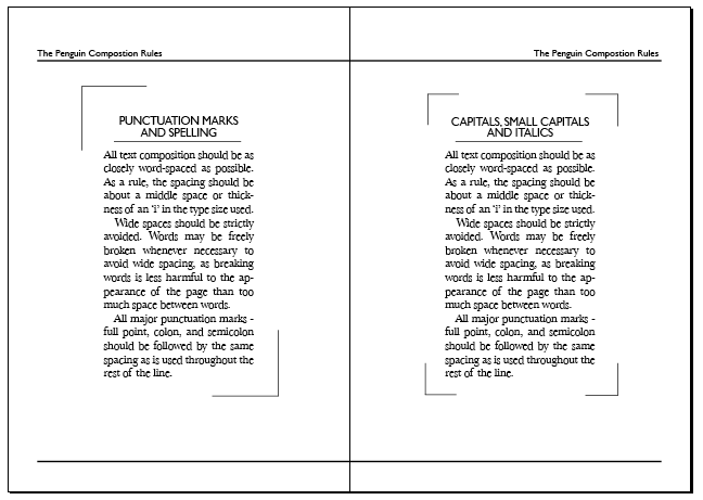
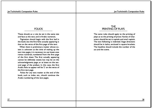
Once at Penguin, Tschichold implemented the 'Penguin Composition Rules' in order to establish a more consistent system of layout and composition. These standardized formats and typographic specifications addressed word and letter spacing. For example Tschichold mandated that compositors avoid wide spacing for body text. He told compositors to use the letter 'i' as a guideline for proper spacing.


More about Edward Young: http://www.guardian.co.uk
"Edward "Teddy" Young, who has died aged 89, was the man who found the penguin for Penguin Books - literally, at London Zoo. Later, he immortalised his distinguished war service as a submariner in the bestselling autobiography, One Of Our Submarines.
After attending Highgate school, north London, Young went into publishing, working his way up at Bodley Head to designing dust-jackets, for which he showed a natural aptitude. This was remembered by Allen Lane when, in 1935, he resigned as managing director to effectively invent the modern paperback.
Lane chose to call his new enterprise Penguin Books, and sent the 22-year-old Young to London Zoo to make sketches of the eponymous bird, which soon became world-famous as a symbol both of the company and of affordable, high-quality books. Young also designed Penguin's instantly recognisable paper covers, with their colour-coded bands: orange-white-orange for novels, green for crime, and pale blue for the Pelican series of accessible books on academic subjects.
After four years at Penguin, Young moved to the Reprint Society. But with the threat of war, he joined the Royal Navy Volunteer Reserve, where his experience as a yachtsman earned him an instant commission as a sub-lieutenant."


Above: Logo Development 1935-2005

Above: The Marber Grid - 1962


An example comparison of two different book covers: jamesbrookdesign.blogspot.co.uk
Useful Links:
_______________
After carrying out thorough research from a broad range of sources both online and offline, I began to form a list of the key individual elements of design relevant to the progress of Penguin book cover designs. These included:
-The Birth of Penguin and its origins
-Horizontal grids (cover layout)
-Colour coding (cover colour)
-Edward Young: a brief introduction and description of his time working with Penguin
-Penguin logo development
-Jan Tschichold: how he reinvented Penguin
-Jan Tschicholds composition rules
-Gill Sans: about the typeface & its common use in Penguin books
-Germano Facetti & Romek Marber - brief introduction
-The Marber Grid

_______________


The refined version of my second logo development double page spread included two bars - one along the top and one along the bottom. I decided to keep this layout element consistent throughout my publication. I thought that the division of the page was necessary to form a greater structure and also to add visual emphasis to the horizontal grids used on Penguin book covers.

I wanted to include Jan Tschichold's Penguin Composition Rules as I felt they are the most honest reflection of the development and structure within Tschischold's book cover influence. The rules are intended to be easily read and understood therefore I felt it wasn't necessary to over-complicate the design and layout of these pages. As a small extra feature I experimented with different borders and frames to add a greater status to Tschichold'd rules.


Logo Development
One of the main elements I found interesting while carrying out research into Penguin book covers was the evolution of the logo. The simple Penguin icon changed a vast amount between 1935-2003. I found a source in the book 'Jan Tschichold Designer, The Penguin Years' by Richard B. Doubleday. This showed the range of different logos. As these were not in chronological order I found it quite difficult to visualise the development clearly. I decided it would be best to recreate my own layout to show a clear timeline of the development. I experimented with different layouts and
The Final Pages:


_____________________________
Designing A collection of Bookmarks:


The Final Bookmarks
I created eleven final bookmarks - one for each year the Penguin logo evolved. As the target audience was people interested in literature but also design, I wanted to include short facts or quotes. These bookmarks would then either be sold as limited edition collectables, but could also work as individual bookmarks. Each bookmark includes the Penguin Books publishing name to the top centred, the Penguin logo in a band beneath, leaving the remaining space for the fact or quote. The date for eat logo is placed at the bottom of the bookmarks in a slightly larger point size than the body copy. The layout was intended to subtly resemble the horizontal grids of the Penguin Book covers. Finally I created a border to be used for all the bookmarks. This started as a template in InDesign, but I modified the colours to match the orange and black colour scheme of my publication front and back cover.

A PDF version of my Publication:
In general I was pleased with my final outcomes. The main point of this publication was to address a brief history of Penguin book cover design during the Jan Tschichold years. The key synthesis element to my publication was the subtle obedience and implementation of the rules. I decided to keep it simple in order to focus on the production. The appearance resembles an existing Penguin Book classic, following Tschichold's rules. If I was to carry out this task again I would generate a better structure for the development in order to experiment more with the final outcome.
Thanks for sharing this information..
ReplyDeletehttp://www.diybookformats.com
I like your article,.thanks,
ReplyDeleteon demand books
good job :)
ReplyDeletewhat font size did you use? ( for title and body text )
thanks!
I really like your article this is best thanks for sharing us.
ReplyDeleteBuy Logo
Very useful and informative blog. Thank you so much for these kinds of informative blogs.
ReplyDeleteWe are also a graphic services in gurgaon and we provide the website design services,
web design services, web designing services, logo design services.
please visit our website to see more info about this.
Freelance Graphic Designing
Freelance Catalogue Designing in delhi
Freelance Catalogue Designing in gurgaon
Freelance Brochure Designing
Freelance Label Designing
Freelance Banner Designer
Freelance Poster Designer
graphic design services in delhi
graphic design services in gurgaon
Freelance Catalogue Designing in delhi
Freelance Catalogue Designing in gurgaon
Freelance Brochure Designing
Freelance Label Designing
Freelance Banner Designer
Freelance Poster Designer
graphic design services in delhi
graphic design services in gurgaon
freelance website designer in gurgaon
freelance designer in gurgaon
freelance web designer in gurgaon
freelance graphic designer services in gurgaon
freelancer graphic services in gurgaon
freelancer logo services in gurgaon
freelancer web designer services in gurgaon
freelance website designer services in gurgaon
freelance logo designer service in gurgaon
logo designer in gurgaon
brochure design in gurgaon
logo design in gurgaon
freelance logo design in gurgaon
graphic designer in gurgaon
freelance logo designer in gurgaon
freelance graphic designer in gurgaon
freelance graphic designer in noida
freelance graphic designeing in gurgaon
I know you are looking for a perfect logo design?
ReplyDeleteBuy a logo with 6O% Off. Custom Logo
I really was trying to find some kind of helpful article like this & now i found this thanks for sharing it with us.
ReplyDeletewe design custom websites & custom logos with a guarantee if you have an interest in web designing or logo designing then visit us?
Logo Designers
Thank you.
ReplyDeleteI decided to use the Penguin covers as a template for my volumes of essays. Now that I have read this, I am going back to re-work a few covers to bring them more into line with the Tschichold style.
Again, thank you