For this project, I wanted to come up with a concept which clearly portrayed the key themes of my essay, in a physical form. As my essay was focusing on identity and constructing 'the other' within Hip Hop culture, I thought about different ways I could produce a physical product which clearly conveyed the most important elements of hip hop culture.
My initial idea was to create a series of posters. I wanted the posters to incorporate the four pillars of hip hop culture outlined by Afrika Bambaataa: MCing, DJing, breaking and graffiti writing. It was also essential that my concept included reference to certain elements outlined in my essay such as social groups within hip hop, and also gender roles. As this was a vast amount of information to contain in such a specific format, I thought about the most effective ways to present my information.
The majority of my research was spent listening to a wide variety of hip hop tracks and analysing the lyrics. I wanted to get a good understanding of the general meanings behind certain songs in order to find a select few relevant to my essay. The broad range of topics covered in the lyrics made it difficult to decide which artists to choose.
Initially, I began experimenting with quotes and lyrics from Jay-Z and Queen Latifah. The initial experiments in Illustrator are shown below. They began as really simple, typographic posters with a full focus on the quotes:
The original typeface I experimented with was Bebas Neue. I wanted to work with something bold and eye-catching to support the Artist's strong passions and emotions towards hip hop.


_____
During the early stages of my design development, I came up with the new idea to make a series of vinyl sleeves. I figured that vinyl sleeves would be a more appropriate product to support my essay as they were a big part of the music culture back when hip hop originated in the 70s. During a short discussion with Richard, I suggested this idea with the possibility of foiling the vinyls to symbolise the 'bling' of hip hop culture. As image and wealth are two core elements of the hip hop identity, I thought this would be an interesting and relevant approach.
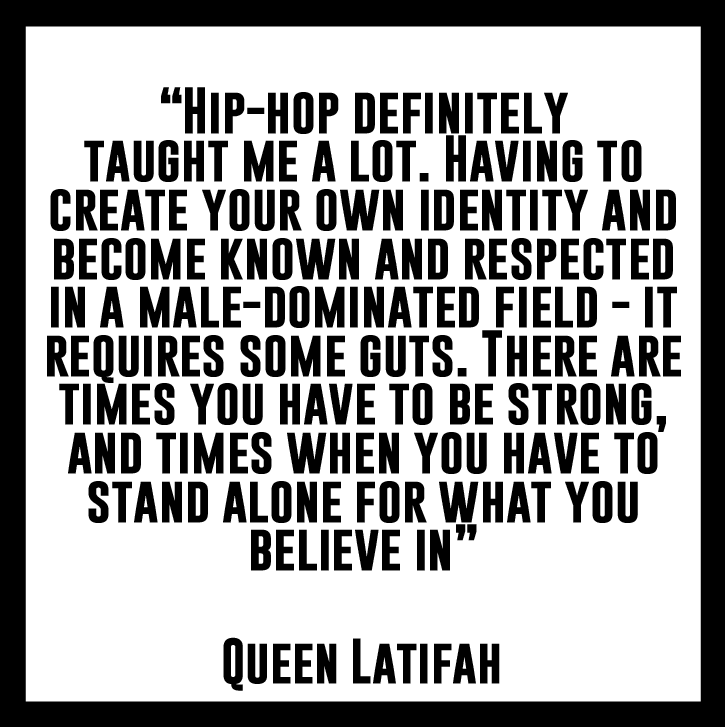
Richard was pleased with the idea, suggesting it could be interesting to think about collectors vinyl box sets. This gave me a good base to start thinking about scale, format, colour and function. I returned to my research on hip hop lyrics to gather more content for my vinyl covers. As Queen Latifah's lyrics and comments on hip hop were supportive of my essay, I continued to use her as one of my four artists.
In order to get the correct measurements and as physical research, I went into a charity shop where they had an offer of 5 7" records for £1. I bought these to see how they had been made and get an idea of the different stocks and paper weights.

The song I chose to use for Queen Latifah was a song called 'U.N.I.T.Y.' This song supports the observations made about the male-dominant aspect of hip hop and the female's fight to change it. As the lyrics were relevant to the vinyl cover concept, I wanted to incorporate them into the design too. I did this by filling the vinyl cover with the lyrics in a small lower-case to work as a backdrop. In order for this to work I needed to justify all the lines individually, ensuring it fit exactly. This was first tried out using Helvetica Neue. The developments are shown below:


After placing the lyrics into the record sleeve frame, I placed the quote ontop of the lyrics to see how the two would work together.

Personally, I preferred the vinyl when the colours were reversed to white text on a black background. The type stood out more effectively, and the design looked more sophisticated.


Unfortunately, due to time restrictions, I knew I realistically wouldn't be able to expose a screen. As screen-printing would have been the only possible method to print white onto black, I wouldn't be able to. As a proposal idea, I created a mock-up of this design variation in Photoshop. It also helped me to see my design in context.

Once I had accepted there was not enough time to carry out the processes I had originally hoped for, I reconsidered my next staged of development. For my last two artists, I wanted to include KRS-One as I had directly quoted him in my essay. I then wanted to concentrate on Salt N Pepa - one of the first successful female rap groups. This then meant I was working with two female rappers, and two male. I wanted to see how different the lyrics looked in comparison to one another.


KRS-One: Hip Hop Lives

Queen Latifah: U.N.I.T.Y

Salt N Pepa: Ain't Nuthin' but a She Thing

Jay-Z: Heart of the City (Ain't no Love)


Adding a thick border around the edges of the vinyl gave the overall image more impact. The typeface I decided on was Gobold Bold. I liked this font's narrow, striking and legible aesthetic.


_____


As I was informed there were no available laser cutting slots until after the COP2 deadline, I began to attempt cutting the quotes out by hand with a scalpel.. This proved to be close to impossible however, so I had to reconsider my production method for a third time.

As a final resort, after speaking to my peers about my time restrictions and not being able to complete the gold foiling, it was suggested that I should try experimenting with creating gold borders around each of the vinyl sleeves.
I thought tho would be a much faster print method which would allow me more time to get the best result possible. Working with two measured out 7x7" paper templates, I covered the front and back of the vinyl sleeves. This mean the only sections showing were the borders and edges.


My first few attempts were carried out on the black and white mock versions of the vinyl designs. I first experimented with simply spraying the gold paint onto the flat template. However, because the templates were not secured to the design, they moved as soon as a I used the spray paint.

This then made me curious to see how readable/viewable the design would appear through the light application of the gold spray paint. This experiment proved the paint was too thick for this method as it almost fully covered up the designs. This method was also not ideal as it was difficult to keep a consistent light pressure when applying the paint.

For my third attempt, I experimented using a tiny amount of spray mount to hold the template in place on top of the design. From previous uses of spray mount, I knew I would be able to remove the templates again without ripping or damaging the design below as long as they were placed lightly and for a short space of time. I was really pleased with this outcome - the templates effectively covered the main designs, leaving a bold, neat and clearly defined gold edge on both the front and back of the vinyl cover.

The only downside of this experiment was that it was difficult to see the original vinyl net/template beneath the gold paint. This made the cutting process more difficult and time-consuming. I remembered this for the next few attempts, knowing to cut the template out beforehand.

Once the paint was dry, I folded and glued the vinyl cover to see how it would look as a final design. This also meant I was able to compare it to the vinyl sleeves I had been using as original inspiration. The dimensions worked perfectly and the vinyl record was able to slot comfortably into the sleeve.


Due to the large amount of spray paint needed, with a small amount of space, I often had to take breaks allowing the paint to dry. This was another time-consuming factor which could have been avoided if I had planned my time more carefully.

Fortunately, the day before the module submission, I was able to get my hip hop quotes laser cut. I used a thick white card - similar to my original templates. Luckily the stencils came out really well considering the short amount of time I had to create them. It was a shame however that I only had one day to experiment with these before the hand in!


I placed the stencils on top of the front side of their vinyl design (the lyrics side). I used paper clips to hold the two in place this time.


In reflection to this project, I think it was probably one of my favourite. Apart from the multiple time restrictions, I really enjoyed researching into the lyrics of hip hop as language is something I am particularly interested in. I was not entirely pleased with my final outcomes as i felt they were rushed and not made to the best quality. I still think the designs would have worked much more effectively had they been foiled with gold instead of spray paint. However, the spray paint effect ties in with the concept of hip hop culture as it is used for graffiti art. As graffiti is outlined as one of the 'four pillars of hip hop' by Afrikaa Bambaataa, the concept is in a way better justified.
I think the key focus of this project was the concept over design quality. Realistically I knew my final outcomes were going to have flaws due to not enough time to recover from various mistakes encountered along the way. If I were to carry out this project again, I would definitely screen print the quotes and possible use a black/ more unusual stock to give the vinyl sleeves a bigger sense of importance and value.
Finally, I was intended to create a small belly band or container to keep the four vinyls together and emphasise the fact they were a set e.g a collectors edition. Unfortunately I didn't have time to do this either so that is something I would definitely create next time. From this project, I have learnt that a lot of work can be produced in a short space of time -- but if the design aims are unrealistic in the given time frame, the outcomes will reflect a rushed creative approach. I need to learn to be more realistic and not attempt to produce more work than is physically possible.
No comments:
Post a Comment