Find 5 images of Modernist graphic design and 5 images of postmodernist graphic design.
Write a short critical analysis of each image, which focuses on:
a) Why you consider each image to be Modernist / Postmodernist
b) Whether you think that the image is successful or unsuccessful
c) relate your analysis to the terminology introduced in the session
d) Use at least one quote from the essay by Massimo Vignelli to back up your analysis
Modernism
Great Beginnings
Paula Scher and Steven Koppal
1980s

Swiss Modernism

Swiss modernism is well know for its clean-cut, well executed and professional style. The designs, such as the one above, follow strict rules which are simple yet visually engaging. This is a good example of how confined space can be used imaginatively through colour and layout. There is a clear sense of the grid system used with the three variations of the word 'fiat'. Although the small text is placed within the main text, there is still order and clarity. The colours are simplistic. They compliment each other subtly without becoming distracting.
Untitled
John M Miller
.jpg)
This piece of work by John Miller is very simple but again engaging. The use of repetition of something as simple as two different length lines mirrored is simple. The artist has focused on the use of imagery alone, leaving no attention to additional colours or shapes. By using these simple methods the artist has created a sense of movement and direction; possibly going up left, or down right. The piece is effective enough and would be less if adapted any further.
Helvetica
http://pinterest.com/nilsbastian/the-swiss-style/
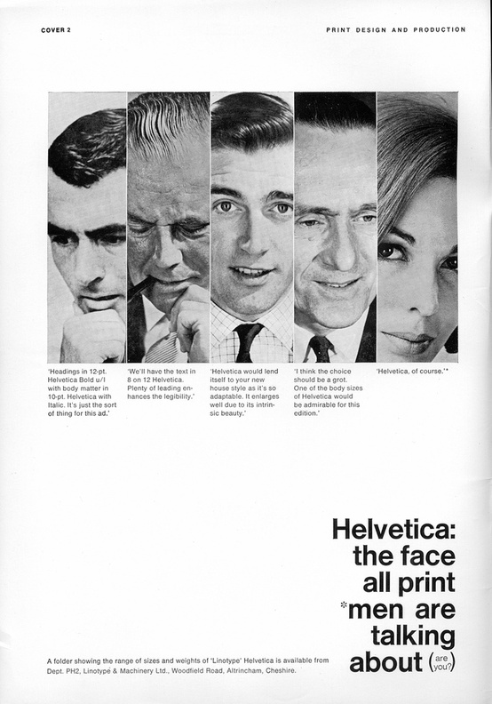
Helvetica is very often used within modernist art. The typeface itself follows modern forms; it is simple, easily adaptable, and highly legible. This example of work is effective because it shows a new perspective on helvetica. The advertisement itself uses examples of helvetica, which is already a method of advertisement. The imagery and text combine well together as the whole piece uses black and white only. This example is also successful due to its confined, column-like structure between image and text.
Basic Typography
Ruedi Rüegg/Godi Fröhlich
1972

"The solutions to a problem are in the problem itself."
The use of colour and text in the image to generate numbers through negative space in this image is highly impactful. The colours compliment one another due to the consistent, bold theme. However, the manner in which the text has been placed is what makes this image most unusual. There is an ideal balance of space and text, the numbers are instantly recognisable without need for more detail/text. The underlying context of this image may be simple, but this has not affected the strong visual outcome as seen above.
Postmodernism

Barbara Kruger's work is effective and visually engaging for may reasons. Like the example above, her work is bold, honest and a different perception of everyday life. Unlike the safe and structured qualities of modernist art, Barbara attempts to show a more mundane attitude through her work. This is a good example of postmodernist art as the text and image don't necessarily combine well together. The layout is free and and expressive, unlike modernist art. The use of bright red in contrast with black and white imagery is effective and instantly recognisable.

This piece of postmodernist design by Johnathan Branbrook is again a good example of postmodernism. The type and image is placed in a slightly unorganised, experimental manner, causing the general aesthetic to seem free. There are few signs of conventions used here, although there is a consistency in the use of colour. The image comes across as intentionally clumsy, similar to other post-modernistic styles.

"David Carson’s design aesthetic is best seen through his works. His typographical treatments are first-rate, and he integrates photography to produce a minimal, low-fi look. In his recent work, David Carson has branched out into television and video as well, producing commercials, documentaries, short films, and more." David Carsons work is a very unique and extreme approach to postmodernism. The fundamentals of his work are not always clear as his work varies a vast amount. The image above is not effective in communicating any particular message and is not easily legible. However the unusual format is visually engaging, causing the viewer to show interest.

Neville Brody is another experimental artist. His postmodernist style is again unique and eye-catching. He uses a wide range of approaches with his work, all of which are effective in their own way. The example above portrays this effectively. It is evident that legibility was not the main focus of this piece. By rotating various words and placing a high contrast of text size beside one another, the final outcome is experimental, playful and personal.
i-D, no 28. The Art Issue
August 1985
Styled by William Faulkner, design by Terry Jones.
Photograph by Nick Knight, featuring Lizzy Tear. V&A

The image above is again another approach to postmodernist art. The extreme use of contrasting colours, text and imagery is bold and eye-catching. This is a design of a front cover for i-D magazine - the art issue. However as the outcome is so bold and busy, the connotation and context is distracting and in some ways challenges what art really means. The image could possibly be more effective if the colours weren't so unorganised.
No comments:
Post a Comment